The New Teacher Dashboard
Make sure you get the most out of Tassomai’s teacher dashboard - whether you’re a TassoPro or new to using the site, find out what every part of it does and how it can help you and your students.
If you haven’t used Tassomai before, we’d recommend watching this video first to find out how Tassomai works and to get familiar with the teacher dashboard.
Selecting students
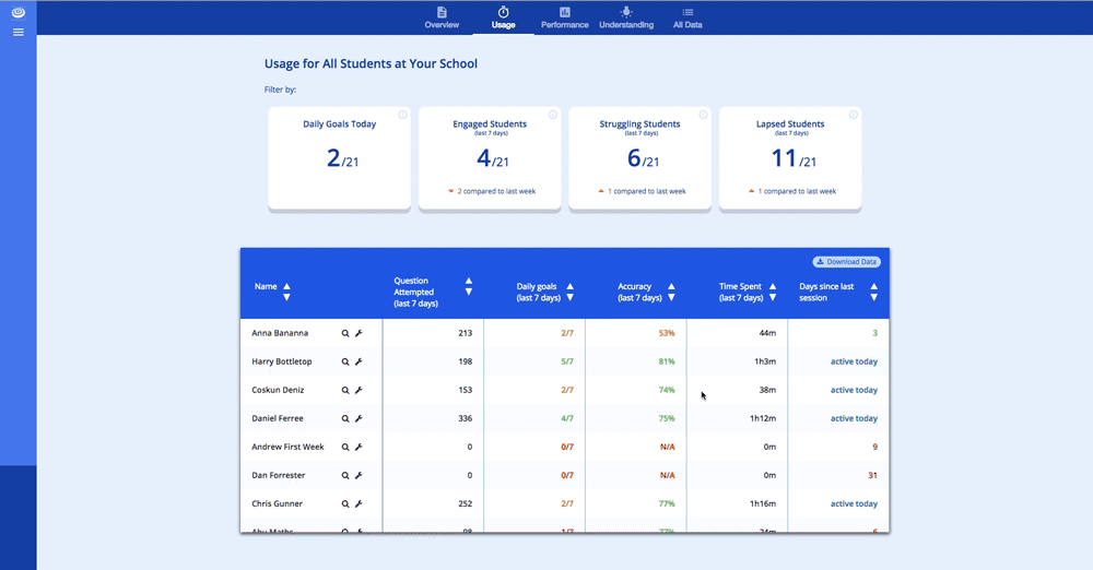
The default view is an overview of all the students at your school. However, you can also look at data for a single year group, a class, an “additional group” or one student [the individual student view is explained later in this article].

The default view after logging in. Years, classes and additional groups are all expandable and collapsible.
To choose a different group of students, look at the menu on the left hand side. Under “My Groups” you’ll see every year group which you teach a class for - click on the year you’re interested in to see the data for every student you teach in that year.
This will also expand the left hand menu, giving you the option to choose classes or additional groups (if you have them set up). Click on “classes”, and you’ll see every class that you teach in that year.
The “All Students” section works in exactly the same way, but shows you every class and additional group in the entire school.
N.B. If you don’t have any additional groups set up yet and would like some, simply contact the TassoTeam and we’ll create them for you - schools often use additional groups for tutor groups, houses or interventions.
The Tiles
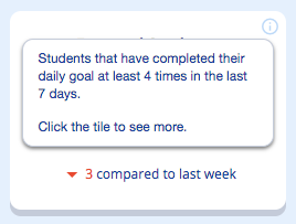
The “Engaged Students” hover over
The dashboard has 8 tiles on it to give you an overview of how your students are doing on the program. In the top right corner of each tile is a small “i” - if you hover your mouse over this it will give you a bit more information on the data in that tile.
The top row is focussed on Daily Goals; clicking on any of these tiles will show you the “Usage” table for that class, ranked by number of Daily Goals completed in the last 7 days.
If you click on “Engaged”, “Struggling” or “Lapsed” it will also filter the table by whichever criteria you chose. An “Engaged” student is one who’s completed 4 or more Daily Goals in the last 7 days, a “Struggling” one has completed 2 or 3, and “Lapsed” is 0 or 1. To remove the filter just click on the tile again. [N.B. The filter for “Daily Goals Today” does not yet exist, but is coming soon].

Applying and removing filters
Clicking any of the tiles on the bottom row will open the “Performance” table, ranked by the relevant statistic. “Low Accuracy Students” will also apply a filter, showing you any student whose accuracy in the last week is under 50%.
The Tables
As well as opening the “Usage” and “Performance” tables by clicking on the relevant tiles, you can also go to one of them by clicking on the buttons along the top. The “All Data” table just shows you both Usage and Performance in the same view. Every column is drag and drop, so if you want to compare specific bits of data you can.
Although most of the statistics are intuitive, some require slightly more information.
“Days Since Last Session” only counts days on which students answer a question - if a student logs in and doesn’t answer a question, it doesn’t count.
“Progress” is gained when students answer questions correctly. When a student has answered a question correctly three times in a row they are considered to have “mastered” it, and have 100% progress on that question. To fulfil the grade guarantee students need to reach 80% progress.
“Projected Final Progress” is calculated based on work done in the last 30 days and time remaining until the exam. It is rounded to the nearest 5%, and won’t display any data until that student has used the program on 4 different days.
The columns which are colour coded are the ones which we feel are the most important, and require the most attention.
Understanding
The Understanding grid is Tassomai’s most powerful analytical tool, and to really understand how it works we’d recommend you watch this video or read this blog post about it.
It is, in effect, a self-populating PLC grid. As students answer questions, the dots will grow in size (to show how much of the content they’ve seen). The colour of a dot represents a student’s accuracy in that area - blue means they have mastered most of the content, green means they are getting the majority of questions correct, orange means their accuracy has been a bit up-and-down, and red means they are struggling in these areas.
If you click on a subject name along the top of the grid it will open up the topics within that subject, and clicking on a topic name will show you that topic’s themes. Look out for red and orange dots - these show where students need intervention.
The Understanding grid is extremely useful for organising intervention groups, since you can see areas where groups of students are struggling. It can also help you to identify which students are experts on a topic, and let you target more effective homework assignments by focussing on weaknesses instead.
Individual Students
To look at an individual student in more detail, click on the magnifying glass icon next to their name. This will show you data for that student for the last week, as well as historic data.
You’ll also see their “usage graph”, showing you how many questions they’ve answered each day. This has three different date ranges available: Last 7 days, last 30 days and all time.
How to look at individual student’s data
The “Subjects” button along the top of the dashboard lets you see that student’s progress in each subject and topic - use this to make sure students aren’t ignoring certain topics when using Tassomai.
The “Settings” tab can also be reached by pressing the spanner icon next to a student’s name. It’s here that you can update a student’s details if they’ve entered them incorrectly. Students regularly forget their password; if this happens they can request a password reset email at the login page or you can update it for them. If the password reset email isn’t sending it’s likely because their email address is incorrect, and you can fix this here as well.
You can also move a student between classes if necessary, or add them to an additional group in settings.
Lesson Plan
If you are looking at a single class, there will be an extra button on the top right - “Lesson Plan”. This is where you can control the topics which your students see. By default your students will have all the content in the specification turned on. This means that students might see topics on Tassomai which they haven’t yet been taught in class.

How to pause topics
This is intentional, as it allows students to benefit from Tassomai’s inbuilt flipped learning functionality. However, if you’d rather students were only tested on topics which you’ve already covered in class you can pause topics in Lesson Plan.
Simply untick the topics which you want paused, and then click “apply changes” at the bottom.
Remember to turn topics back on at some point, or your students will never study them!
N.B. This can only be done for a class, not an entire year or an additional group. Students can temporarily pause and unpause topics, but their content will revert to your settings at midnight every day.